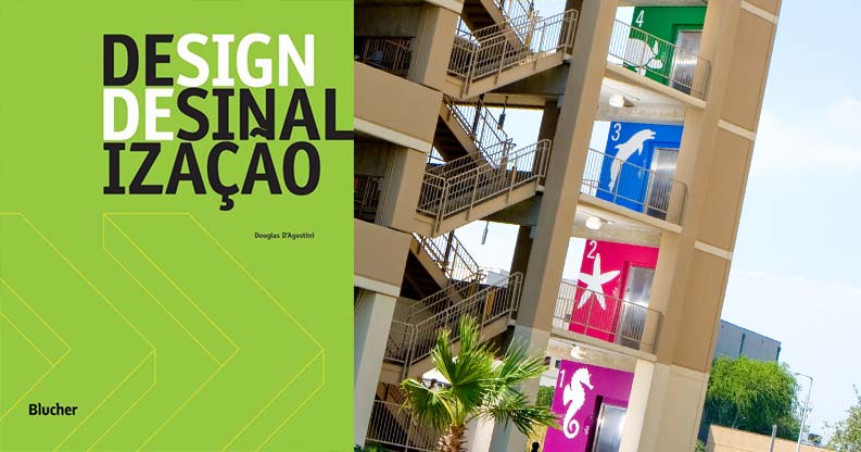
Strong color and visuals facilitate memorable wayfinding system in “Design de Sinalização.”
One of Janke’s experiential graphics projects recently found its way into the latest “Design de Sinalização”, published in Brazil. The book is intended as a guide in the study of Signage and Experiential Graphic Design. The particular project by Janke was the Christus Spohn Hospital – Corpus Christi, Garage Signage Design Program. The author Douglas D’Agostini notes that:
“When elaborated in a clear way, the use of a color and visuals strategy acts as a differentiator and organizer of the similar spaces and an aid in guiding people throughout the different sectors – called an Orientation System. 5.6 | 5.7 Some spaces, such as parking garages, use colors as the identification code among floors, facilitating the memorization of these places.”

