Formation Story No. 1: Creating a stronger sense of arrival with one campus entry
Client: Austin Oaks Church
Challenge: Create a stronger sense of arrival at the main campus entry. One that celebrates the church’s new contemporary brand
Steps:
- Entry and planting survey and city signage code research
- Demo coordination of existing monument sign and tree removal
- Redesign a stronger entry monument presence that is more visible and clearly represents the church’s new brand identity and direction
Unique Approach: Fast tracked code review and hand sketched concepting for quick design review and approval
Conclusion: The entire team struck exactly the right balance between the church’s history and their direction forward
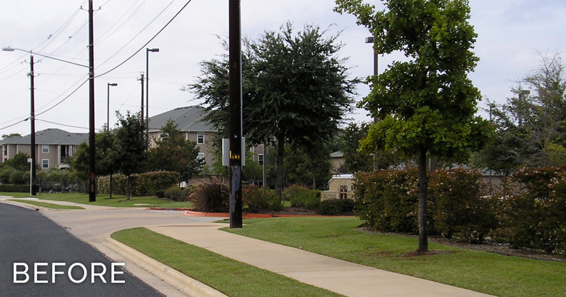
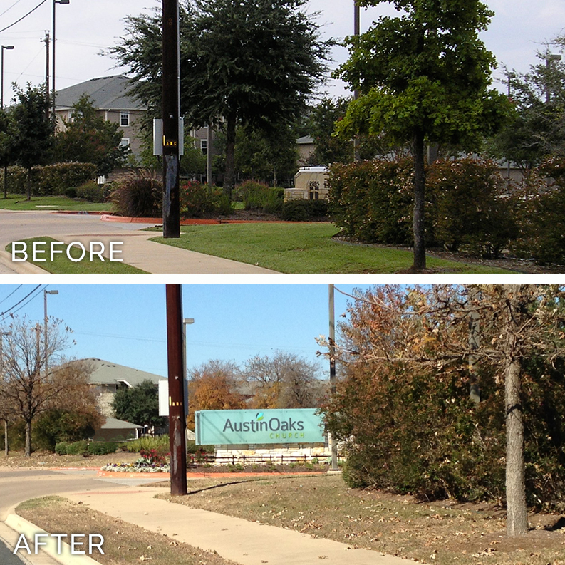
BEFORE: The existing monument was fairly hidden from approaching traffic and needed better visibility.
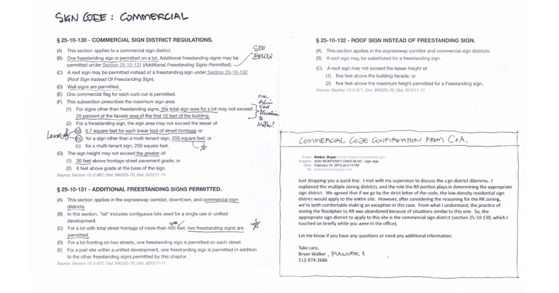
CODE RESEARCH: City signage codes were quickly researched and updated data points were presented to the City since the campus’ code classification had evolved over time. The City updated the site’s code standing which would allow for a larger sign.
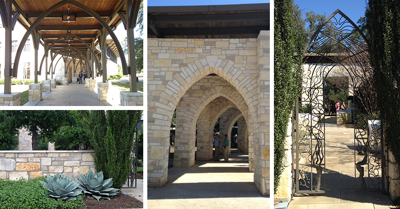
DESIGN INSPIRATION: Design concepting leaned on the different materials and shapes seen throughout the beautiful campus grounds.
INCORPORATING THE NEW BRAND; The new contemporary brand identity had just been launched and needed to be interpreted in the design in a contemporary way. This image shows how the identity lived on the church’s website header, with a glass-like translucent oak tree background… which the glass-like appearance ended up being the final approved design direction.
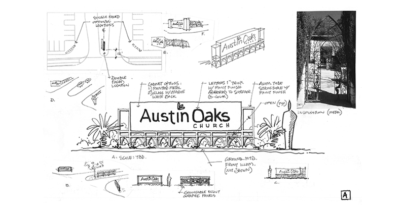
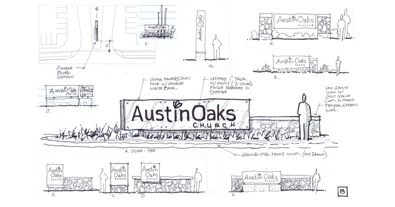
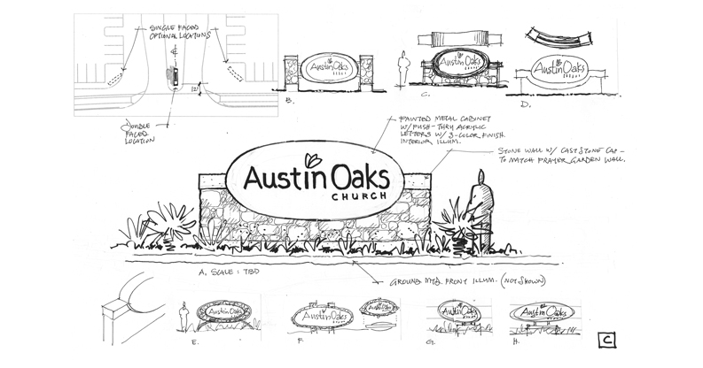
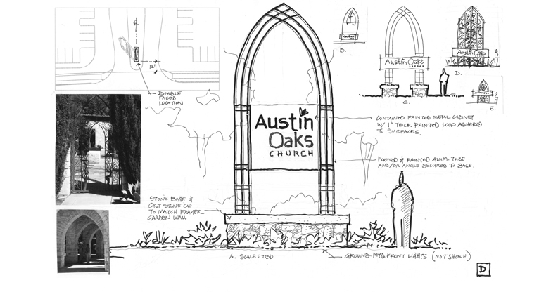
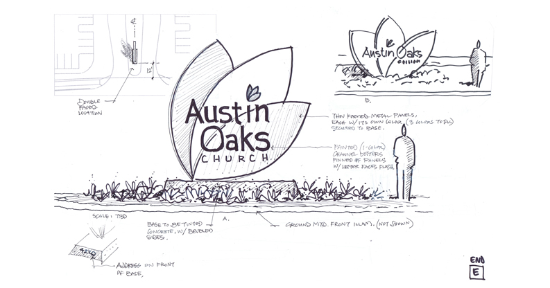
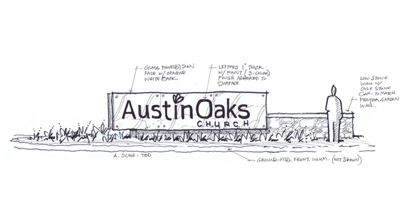
FAST TRACK RESEARCH AND CONCEPTING: Once the City signage codes were finalized, quick hand sketched concepts were created and presented to the Building Commission for review and approval of one direction. The thought process was included in the presentation, to help decision makers understand how the general 5 directions were narrowed down to each main concept on the page. Each option was inspired by different materials and shapes seen throughout the campus, tying the main entrance into the campus, creating a strong sense of place throughout the campus.
APPROVED DIRECTION: Concept direction “B” was selected, and immediate development began.
DEVELOPMENT: Extensive collaboration occurred between the Facilities Mgr., General Contractor, Stone Mason, Landscape Architect, Sign Mfr., Lighting designers, and the church’s Aesthetic Committee prior to developing the detailed fabrication documentation shown. Brand Standards had to also be taken into consideration.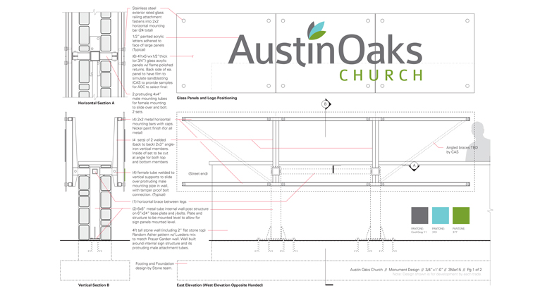
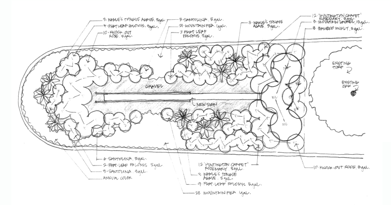
PLANTING AND IRRIGATION: Coordination took place with the Landscape Architect for the creation of the planting and irrigation plans. Lighting fixtures and their locations needed to be coordinated prior to the plans being finalized.
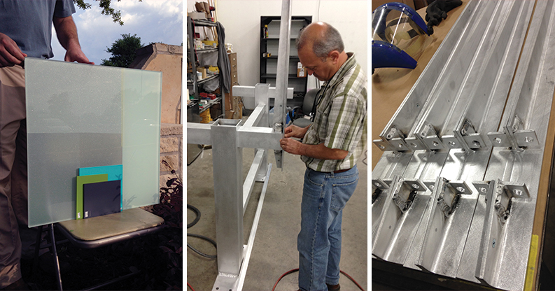
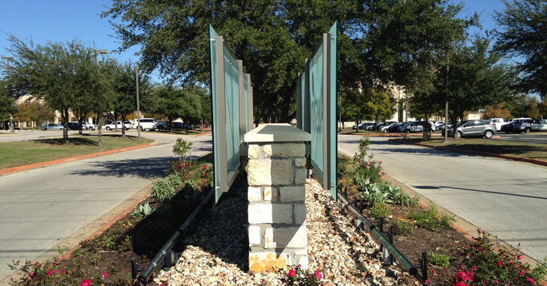
FABRICATION PROCESS: A completely concealed structural mounting and support system was created to live inside the wall, with only visible brackets supporting the glass-like thick acrylic sign face. Custom translucent vinyl applications were tested and brand paint sample comparisons were reviewed.
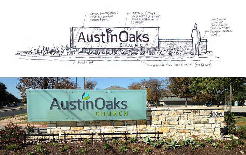
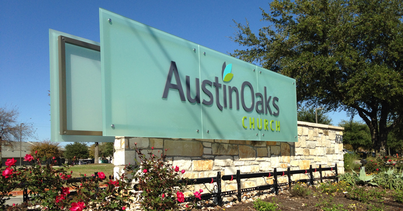
CONCEPT-TO-COMPLETION COMPARISON: Here’s an interesting look back at the selected direction, compared to the final installed monument and its details. Soli Deo Gloria
BEFORE AND AFTER: Now months after the entrance was completed, comments have been overwhelmingly positive, with everyone feeling that it’s a perfect fit and balance for the church, and creates a very strong presence along the road.
TESTIMONIALS:
“The sign is fabulous! Thank you so much for the beautiful design. As usual, you struck exactly the right balance between the church’s history and our direction forward.”
– Louise Polkinghorn, Mgr. of Administration, Austin Oaks Church
“I can’t quite express the joy I feel each time I drive onto our church campus and pass by our new Austin Oaks Church sign. Its design is so fresh and conveys a new life that I know will attract the attention of everyone who drives by our main entrance.”
Soli Deo Gloria,
– Rob Harrell, Senior Pastor, Austin Oaks Church
CREDITS:
Identity Design: Austin Oaks Church
Landscape Design: Es2dio Landscape Architecture
Lighting Design: FSG
Sign Design: Janke
Sign Mfr: Capital Architectural Signs
Stonework: Frontera Builders


