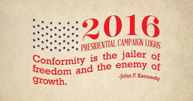
2016 Presidential Campaign Logos
By Matt Himes
As the 2016 Presidential election draws closer and more and more hopefuls announce their candidacy, we figure now is a good time to provide some riveting intellectual commentary on several of the recently unveiled campaign logos. After all, each candidate’s design teams must have put in literally dozens of hours of work, and we wouldn’t want that to go unnoticed.
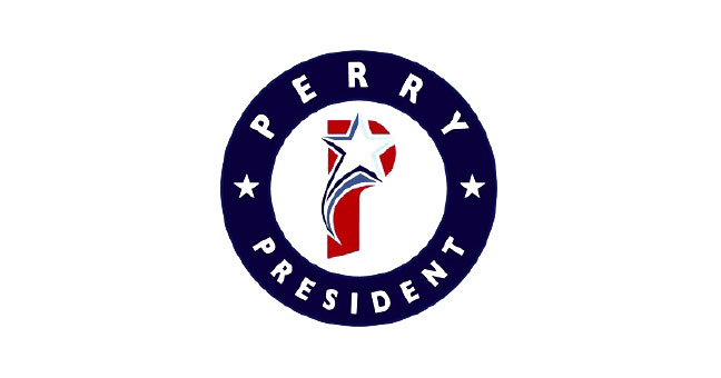
Rick Perry
Pros: Alliteration?
Cons: Not sure if we’re supposed to vote for Perry, or cheer for the Phillies.
While the designers behind Rick Perry’s campaign logo astutely picked up on the potential for alliteration with the letter P (P is for Perry. P is for President. P is for Politician), there are several things about this logo that are head scratchers. The shape of the red “P” seems stretched and disproportionate, while the star seems awkwardly sized and mysteriously utilizes three different blue colors, creating a busy composition that seems disconnected from the circle around it. Oh, and those extra 2 stars in the circle are completely necessary.
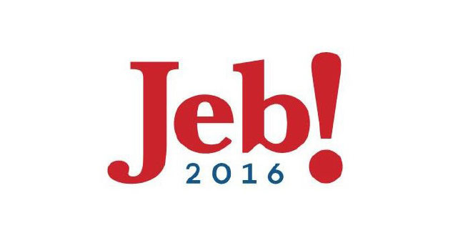
Jeb Bush
Pros: Simple & Consistent
Cons: I wish they would stop shouting at me
The first thing that stands out about Jeb Bush’s 2016 campaign logo is the exclamation point. It is bold and in your face. Bush’s team has been using it a long time, and it has clearly worked well for him. The simplicity of it is refreshing, and the lower case letters convey a certain openness or honesty that helps Jeb come across as friendly and approachable. The main issue with this logo lies in the choices of typography. While the lowercase letters make sense in establishing a casual tone, the choice of typeface makes it look like a logo any kid with a computer and MS Paint could create. You are running for President of the United States and not of the He-Man Woman Haters Club, right? Choosing a typeface that appears more formal and dignified might help him come across as more of a polished and buttoned-up candidate, and less of a day-time TV personality.
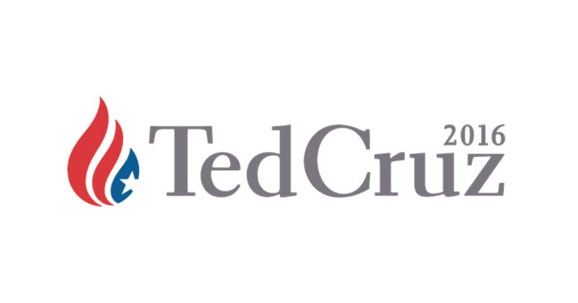
Ted Cruz
Pros: Typography
Cons: What the heck is that thing on the left?
In contrast to the Jeb2016 logo, Ted Cruz’s campaign logo makes some very sensible typographic choices. By picking a more traditional Serif typeface and exaggerating the serifs, Cruz’s team has helped him come across as distinguished and presidential. But why did they have to add the confusing mark? What is that anyway, a drop of blood, water, a flame? Besides the obvious faux pas of associating fire with the American flag, this particular symbol simply doesn’t do the trick. It’s meaning is ambiguous and does nothing to define who Ted Cruz is or what message he is trying to communicate.
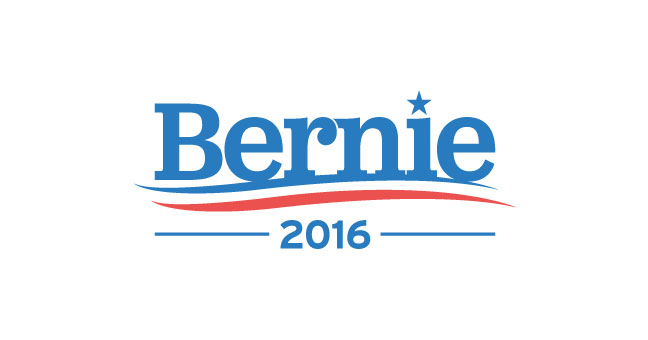
Bernie Sanders
Pros: Bernie…the name just sounds nice and neighborly
Cons: The logo makes me want to brush my teeth.
Put aside the fact that his name appears to be sitting atop a fresh strip of Aquafresh toothpaste. Bernie Sanders’ logo for his 2016 Presidential run is very minimal, but evokes a fitting tone. Its simplicity hints at honesty, and while the exaggerated serifs on the letters are a bit much, the capitalization of only the first letter of his name helps him communicate a lighthearted and cheerful tone, without appearing too undignified.
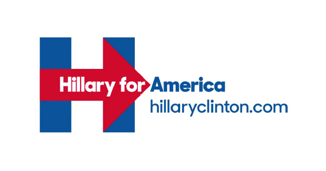
Hillary Clinton
Pros: Nice versatility
Cons: Is Hillary trying to Fed-Ex me something?
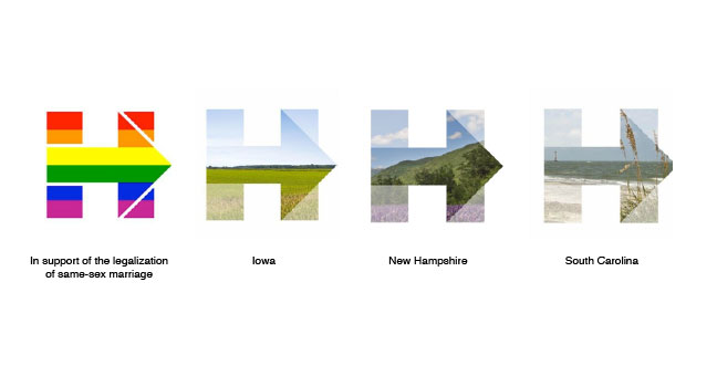
Hillary Clintons 2016 campaign logo pulls no punches. It is strait forward, simple, and articulates movement. It also benefits from its versatility (as seen below). It is the most minimalistic of all the 2016 presidential campaign logos, which we as designers love, but could prove to be a detriment as well as a benefit. The logo’s simplicity not only permits such flexibility, but it also helps communicate Hilldog’s message in an easily understandable way. The down side may be that it is another example of a logo that could be done easily by anyone with a computer. However, it is in the implementation of this logo that the depth of meaning is revealed, and the creativity is allowed to shine.
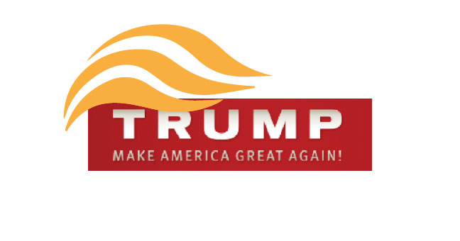
Donald Trump
(No, this isn’t his actual logo)
Pros: If he wins, we could call his plane “Hair Force One.”
Cons: Everything else?