Homes & Land: The rebranding of a leading integrated real estate marketing provider
Homes & Land has a free magazine publication you’ve probably seen as you’ve exited your grocery store or local restaurant, or may have seen in a waiting room; perhaps you’ve even picked up a copy and browsed through it to see the latest real estate listings or to see who the realtors doing business in the area are.
Homes & Land, owned by New Point Media Group, is over 40 years old and is much more than a magazine––it’s an innovative integrated marketing solutions partner in the real estate industry, offering customized plans to realtors that combine print, web, mobile, social, direct mail, and emails in more than 200 markets throughout the U.S. and Canada.
In today’s market where online home listings are dominant, Homes & Land remains a mainstay as a marketing service through their website and their new mobile app that connects the printed magazine to the digital website content –– a valuable tool for those looking to connect with a realtor or purchase a property.
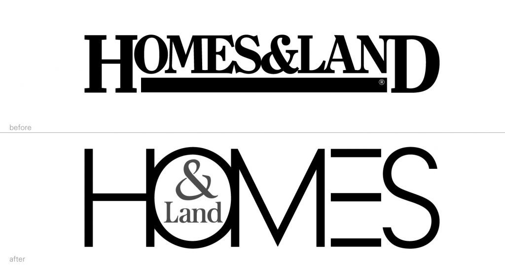
As part of the company’s rebranding effort to transform Homes & Land into the era of self-sufficiency, apps and data driven strategies, NPMG hired Janke to redesign the brand identity, as well as a new magazine cover design. With the goals of attracting new readers and providing a fresh experience for realtors and brand loyalists, the rebrand had its challenges.
After several fact finding meetings, extensive research and brainstorming, Janke presented many concepts for consideration, some of which were subtle changes to the original design and others that were a major departure from the expected. In addition to living on the website, the logo also had to perform on the mobile app, the mobile app icon, and the magazine masthead. The design selected by NPMG is a monumental shift from the previous look of the brand. Gone are the heavy serifed letters, the tight letter spacing, and the bold underline. The new logo is big, open, and optimistic, with a high-end feel. Putting the focus on “Homes”, being that the magazine is predominantly home listings, zeroes in on the primary target audience, while also serving the “Land” that is also part of the realtor services. The fresh contemporary design and color palette succeeds in standing out in a crowd.
Stay tuned for the new brand identity roll out and look for the free magazine on a magazine rack near you.

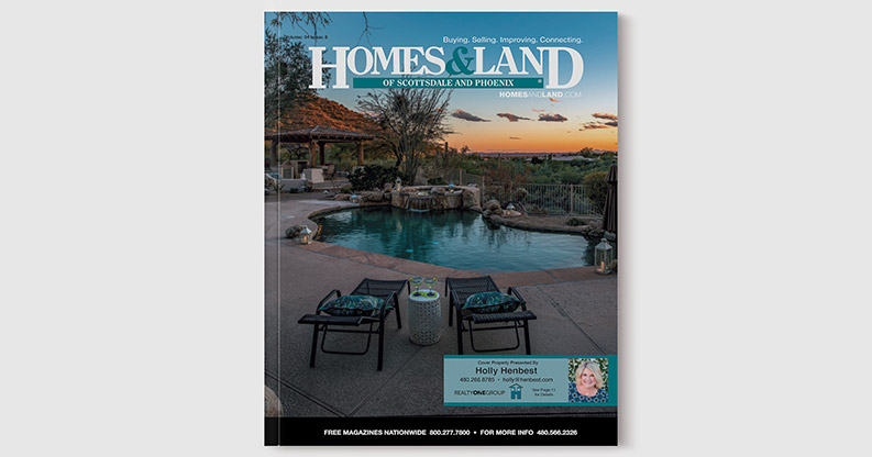
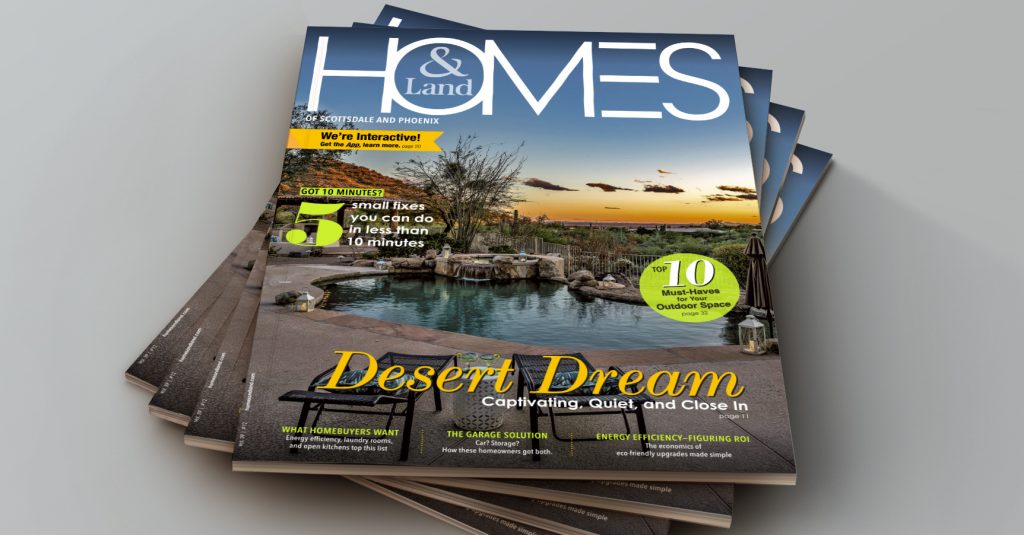
With the logo design unanamously approved, Janke moved on to the redesign of the magazine cover. With dozens of different markets, managed by numerous franchisees, the existing magazine cover designs varied in style and designs across the board. It was time to pull them all together in order to strengthen the brand.

The recommended direction from Janke was to punch up the color of a full bleed professional photograph of the property first, then highlight useful and valuable articles within the issue, on the cover, with appealing subheads and eye-catching typographic treatments to entice potential readers to take a copy. The magazine cover instantly looked fresh and sophisticated.

Another, more simplified version that Homes & Land desired, put the emphasis on the logo and the cover photo / property listing. The inclusion of a custom badge graphic on the cover was also designed to promote the new Homes & Land app, to draw attention to the new app.

The new logo and cover design are currently being tested in select markets with plans to roll out the rebrand to all markets in the next few months. With a fresh new look, the App, and new positioning, Homes & Land is poised to be a serious contender in the real estate game.

