Branding the 2016 Olympic Games in Rio de Janeiro
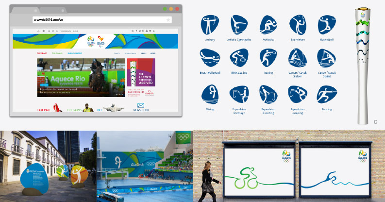
Branding an Olympic Games is in many ways the ultimate challenge for a creative team. It is work that will be seen by people all over the world, it must represent both the spirit of the Olympics, as well as be unique to its host city. It also needs to be flexible enough to be rolled out into the many different applications required for an event of its magnitude, including but not limited to: icons for each city and each event, graphic skins for the different venues, promotional and directional signage, artistic/sculptural applications, as well as branding their multifaceted web presence. There have been many hits and misses over the history of Olympic brands, but we feel that the Brazillian design studio Tátil design de ideias hit the nail on the head with their design solution for the 2016 Games in Rio.
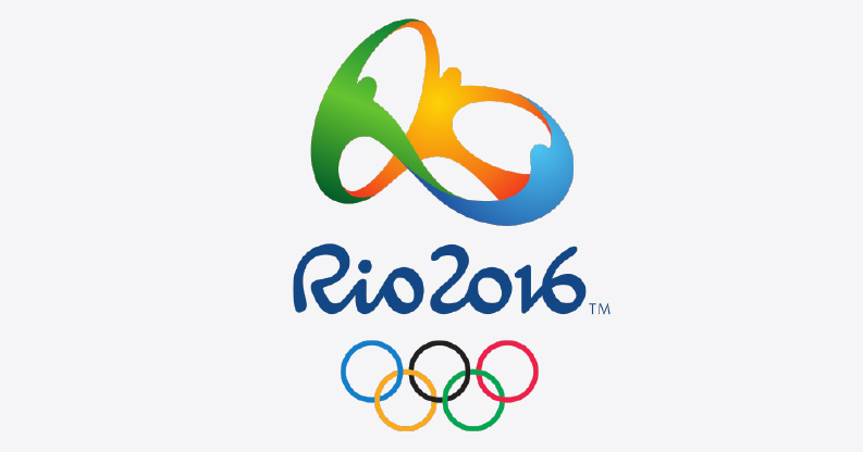
The official “Emblem Essence” as it is explained on Rio2016.com, is one of “Passion and Transformation: through sports, of a city and a country, and of a planet and its people.” But what we like about it is not told in flowery explanations, it is found in the inspiration behind the emblem and more importantly in the process of bringing that inspiration to life in a way that is both aesthetically beautiful and representative of the unique style of Rio.
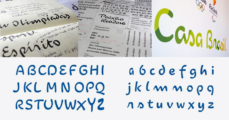
The team at Tátil design de ideias drew inspiration from the surrounding landscape, as well as from different aspects of Brazilian art and culture. The concept of the logo, to express passion and transformation, is given another layer of meaning by drawing this connection between the emblems shape and the surrounding landmarks. This avenue of inspiration then led them to develop a whole repertoire of shapes and curves that eventually became a custom typeface that is deployed across the entire campaign.
While the logo itself is smoothly executed and pleasing to the eye, it could be argued that it plays it a bit safe. The typeface, on the other hand, is where the level of creativity is elevated and more risks are taken. To transform the curves and shapes found in in the world around you into a typeface that is cohesive, legible, and fits with the overall look of the brand is quite a feat of creative genius, and the custom typeface for the 2016 Rio Olympics is beautifully executed.
Check out this interesting video about the typeface creation process.
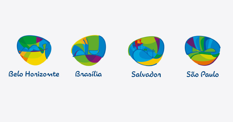
However, creating a great logo and typeface is not enough to successfully brand an entire Olympics. The style and qualities that make these things successful must be deployed across a wide range of applications with pure brand focus. The most notable of which is often the iconic pictograms representing each sport, of which there are over 30. For the Rio games, the creative team utilized the kit of parts they developed in the creation of the logo and typeface to develop the icons in a style that works well with the overall program. They also rolled out the web presence, experiential graphics, and marketing materials in a similar fashion, tying everything together as a cohesive whole. That is not to say the campaign that there is no room for criticism of this campaign, as successful as it is. In particular, the emblems created for each city are so abstract that the distinguishing elements of each city easily get lost in the chaotic mix of shape and color. They seem to be transitioning a bit into fine art territory here, which may be appropriate in some applications, but negatively affects the clarity of the city emblems.
In conclusion, the brand campaign for the Rio 2016 Olympics is a resounding success. It seems to represent the vitality and spirit of Brazil without trying too hard, something that is not easily accomplished. With all the recent news that has been coming out about the concerning condition of the city and its facilities, at least from a branding perspective, the 2016 Rio Olympic games are shaping up to be a pleasing experience.
Image Credits:
http://www.psfk.com/2012/10/rio-official-font-2016-olympics.html
http://www.designboom.com/design/bruno-maag-interview-11-28-2013/
http://www.rio2016.com/
http://www.rio2016.com/en/more-information/games-design/pictograms
http://www.rio2016.com/en/news/news/movement-innovation-and-brazilian-flavour-the-rio-2016-olympic-torch-is-revealed
http://www.underconsideration.com/brandnew/archives/new_look_of_the_games_for_rio_2016_done_in-house.php#.VdIx3ixVhBd


