Being selective with fonts and colors
What’s the big deal about fonts and colors anyway? Can’t you pretty much use any font that you think looks good? The answer lies in what you’re trying to do. Whether your creating your brand identity or a marketing campaign having a strong identity is numero uno. It’s not only the basis of the business’ first impression but it’s the foundation of your marketing and sales campaigns.
When it comes to designing the visual identity deciding which font and color to use to represent your brand has an integral role in differentiating the most adventurous business in the state or the most conservative business in town. Each business type would be designed with their own unique composition of fonts and colors.
If you’re creating a marketing campaign, depending on the type of business you have, you can venture out and find fonts and colors to support your campaign and create a one-of-a-kind unique experience, while still connecting to the brand identity itself.
With a nearly endless number of fonts and color options to choose from, how do you go about choosing the right fit for what you’re trying to do? Here are some of the things we take into consideration when building brands for our clients:
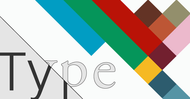
Choosing Typefaces
In choosing a typeface, the first thing to consider is which family of typefaces best fits your brand, Serif or San Serif.
- Serifs – Classic, elegant, traditional. Works best in print. Very readable.
- San Serifs – Modern, sleek, and minimal. Works best in display sizes and on the web.
Choosing Colors
Color is largely subjective, but certain colors do communicate particular ideas and feelings:
- Blue – dependable, authority, intelligence
- Green – peaceful, growth, tranquility
- Yellow – optimistic, energy, happiness
- Black – strength, neutral, balance
- White – purity, simplicity, minimalism
- Red – passion, exciting, bold
- Orange – vitality, success, confident
- Purple – royalty, wealth, creative
There are also many tools and resources available to help with color selection. Some of our favorites are:
Adobe Color CC
ColourLovers
ColorHexa
Other things to consider:
- Traditional businesses (i.e. banker, lawyer) are often best represented by a more classic Serif, while less traditional occupations can experiment with more creative typefaces and still feel appropriate.
- Heavy, bold, and all caps indicates power, stability, and strength.
- Long and thin fonts feel elegant and luxurious and work well for communicating a high class or upscale brand.
- Hand drawn or script typefaces give a custom crafted feeling, but should not be used for body text.
- Be careful when mixing and matching typefaces. For a website, limiting yourself to two typefaces is a good rule of thumb. Of course there are exceptions, but there should always be a clear reason for choosing an additional typeface.
- Try to avoid gimmicky and overused typefaces. A good example of this is Papyrus. If it looks very familiar to you, its probably because you see it all the time. Dare to be different.
- Don’t over think it. Sometimes trying to pin down why something is or is not working can be frustrating and hinder decision making.
At Janke, we understand that every brand is different. We create unique, one-of-a-kind identities for every client, large or small, because we’re all different. Our creative team has the experience and expertise to do it right.